The main point Tufte makes is that there is an abundance of poorly presented data that leads to bad business decisions. He provides many examples, the most convincing being the Columbia shuttle accident, where a risk assessment using data that was ambiguous at best was presented in such a way as to lead NASA engineers to approve the shuttle to land. The course provides tools and guidelines for analyzing data and presentations, presenting your own data more effectively and convincingly, and analyzing the design of the interfaces we work on so that we can make better business decisions.
Tufte opens the day with a visualized piece of music, like this one:
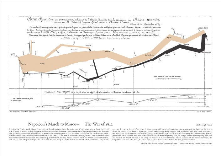
This is used to illustrate how including multiple types of information in a single graphic/visualization can be much more useful than what is usually done - narrowing down information until we have only one or two metrics shown. Here the visualization helps the consumer distinguish the different instruments heard, the length of the notes, and value of the notes themselves (a low C from a middle C, for example). This theme occurs again and again throughout the course - Tufte also uses the Minard Map as a good example of how to visualize multiple data points and metrics in a single place:
Edward Tufte has a reputation for disliking Powerpoint (OK, he did write an article on how it is 'evil'...). He has a section on this in his course, but to me it seems his dislike is not so much for the tool itself as much as how it is used. Specifically, he states that the problem is:
- people often show too little data on slides (due to the limited space they provide)
- many people simply re-read the bullet points when presenting, rather than supplementing them with additional information
- powerpoint slides can be dictatorial/autocratic: the leader often reads the info to the audience, but the audience doesn’t have the notes/background material that went into creating the slides, only what is presented on them
There are some really nice things about how Tufte presents the material in this course. First, I like that he shows pictures and talks to/about them, rather than showing bullet points and reading from them. The course ends up much more like a dialogue than like a lecture because of this. Second, students are given all four of Tufte's books on data visualization, which is a great resource that helps continue attendees' education well after the course has ended. Finally, Tufte uses all four books liberally throughout the day, so attendees get a good overview in the content contained in each; now when I have a question or point of interest I need to look up, I have a better idea of where to find the answer in his books, which has saved me a lot of time since.
Overall I would highly recommend this course. The training on presenting data is very useful - I've implemented his recommendations and received positive feedback on several of the reports I wrote using it. The information on layouts and interfaces was also very helpful. My one hope is that more technical people outside of user experience designers and researchers find the time to attend - engineers of all sorts, from developers and testers to Q/A engineers could all benefit.


No comments:
Post a Comment